10 must-have digital product design elements
Digital products are our bread and butter here at Create Ape — and we know a thing or two about foolproof digital product design elements.
It doesn’t matter if you’re designing a cybersecurity system or a dating app. The products that catch on have one thing in common…they all solve a problem in the most seamless way possible.
You might recognize a few commonly used digital product design elements from product to product. But which ones are the most popular?
10 popular digital product design elements:
- Consistency
- Exciting product messaging
- Minimal user input
- Focused actions
- Strong visual hierarchy
- Sleek UI design
- Personalized experiences
- Eye-catching animation
- Reduced decision-making
- Straightforward features
What are the 10 must-have digital product design elements?
Think about your favorite mobile app (or the one you use most often). What draws you to it? Why do you use it so often?
Do you get sucked into your favorite social media app for its seemingly endless supply of content? Are you always checking your favorite banking apps obsessively to see if your direct deposit has hit yet? Do you never feel like cooking and rely on Uber Eats to keep you fed?
To you, you’re just using a fun app that helps you get the job done quickly. But to a UX designer, it’s all about the strategic placement of features and digital product design elements.
Big-time products undergo a rigorous UX evaluation process where digital product design elements are recommended, implemented, and tested with their target users. This infallible UX design strategy helps companies reach new heights with their offerings and edge out their competition.
These design elements are a surefire way to build a thoughtful user experience with a digital product. Think of them as the secret weapon every UX designer should carry in their back pocket.
Consistency
About 75% of users judge a product's credibility based on its aesthetics and an inconsistent experience could severely hinder your product’s trustworthiness.
Consistency is more than carving out a unique visual identity and carrying it throughout every screen. It’s about ensuring every corner of the design reflects your brand in the best way possible.
This also means that the user flow must be logical to cater to our basic instincts. Have you ever tried to buy a product online, and instead of taking you to the product details screen, the site wouldn’t let you see it without creating an account? How annoyed were you?
Every pixel in your design is a new opportunity to help your user achieve a goal and showcase your personality. Keep this in mind when you’re designing seemingly innocuous screens like terms of service or 404 errors.

Minimal user input
As much as we like talking about ourselves, no one has time (or the interest) to fill out a million questions to use your product.
The really great digital products as of late have gotten us used to instant gratification. Especially when a user needs to solve a problem quickly, it’s on the designer to eliminate as many barriers as possible.
Imagine you’re creating a banking app for a second. Think carefully about the scenarios where your user needs to access the app. Security is critical to users when it comes to their money, but they don’t have time to jump through a bunch of hoops when they need to check their account balance in the line at the grocery store.

Exciting product messaging
A good design is only half the battle. What is a beautiful product without some enticing copy to help the user understand the big picture? It might as well just be some cool wall art at that point.
UX design and writing go together better than peanut butter and jelly. You can have one without the other — but they form a dynamic flavor profile together.
The messaging in your digital product needs to serve multiple purposes:
- Communicate the function of each screen
- Guide the user through each step to accomplish their goal
- Persuade the user of the importance of your product
- Empathize with the user and offer solutions to problems
- Add nuance to your brand identity

Focused actions
Usually, someone is coming to your product with one goal in mind. Whether it’s booking a ride home from the bar, depositing a check in their bank account, or finding a date for Friday night, your product has to understand the basic goals and the actions the user needs to take.
In UX design, choice can become a burden. Too many options cause the experience to become cluttered and confusing. Overwhelming the user is a big no-no in UX.
Take things one step at a time. Pick a goal to focus on, lay out the actions the user needs to take, eliminate potential roadblocks, and get the user where they need to go.
That’s not to say there can’t be any additional features and upgrades, but they need to support the user’s focused goal. Looking at Uber as an example, they let the user choose which kind of ride they want (rideshare, comfort, XL, eco-friendly), but it's all in support of the primary goal…finding a ride to their destination.

Strong visual hierarchy
This digital product design element piggybacks off the last one. You NEVER want to bury the elements that help the user accomplish their primary goal on the page.
Newspapers structure their content by keeping their most eye-catching stories “above the fold.” The idea is that the reader sees a story that piques their interest enough to buy a copy. The same rule applies to visual hierarchy in UX.
The user knows why they’re coming to your product and what goal they need to accomplish. The “above the fold” section of your website is the first thing they’ll see when the page loads, so it’s important to satisfy the search intent right away.
Storytelling is key when it comes to building a digital product, and there’s no stronger introduction than helping the user find exactly what they need right away. Keep the content that satisfies the user’s needs “above the fold,” then structure the rest in order of importance.
Personalized experiences
You wouldn’t buy your Grandmother a motorcycle for her birthday. You also wouldn’t recommend your favorite horror movie to a five-year-old (at least, we hope not).
The best digital products have some element of personalization. Using an algorithm that studies your user’s behavior and interests helps you keep the content they’d be most interested in front and center.
In fact, 54% of users prefer interacting with content that’s personalized to their interests. Think of it as giving a thoughtful gift to your user, where the algorithm says “I saw this and instantly thought of you!”
You can also incorporate personalization through avatars, preference settings, and customizable interfaces. Anything that lets your user give their interface a little personal touch.
Eye-catching animation
On a static screen, subtle animations are an easy way to draw the user's attention to where they need to go. Or you could create dynamic animations to really immerse your user into the interface.
Us humans are visual creatures, and animations can serve multiple purposes in the user experience. They can indicate something as small as an object relationship or alert the user of a change.
You have plenty of room to get creative with a digital product. From microinteractions to 360-degree tours, you can communicate a lot about a product or service with a simple animation (and cut down on the amount of explanatory copy on a page).
Reduced decision-making
Remember when we were talking about the burden of choice? Some people love exploring all the options available to them. Others can feel intimidated by it or anxious about choosing something that’s not the right fit for them.
The key is to understand the way your users think and keep a laser focus on their wants. Get as granular as possible to narrow down to the options that match their needs the closest.
You can reduce decision-making in a few ways. One great way is by letting user feedback guide your design. Your users will give you great insight into the features they need and the things they don’t, which helps you cut a lot of fat from the product.
The devil is often in the details, and something as simple as filters can also help users pick and choose the things they want.

Straightforward features
Your product is the steak, and the features are the sizzle. However, too many convoluted features can leave your product feeling a little overcooked.
The good news is that technologies like AI and voice recognition can be utilized to seamlessly solve problems, big and small. After all, think about how simple things like facial recognition, electronic payments, and chatbots have made your life so much easier.
Your features don’t have to be groundbreaking, but something that clearly answers a user’s question or solves a problem goes a long way. Think seriously about incorporating something fun and interactive like customizable wishlists or product quizzes into your design.

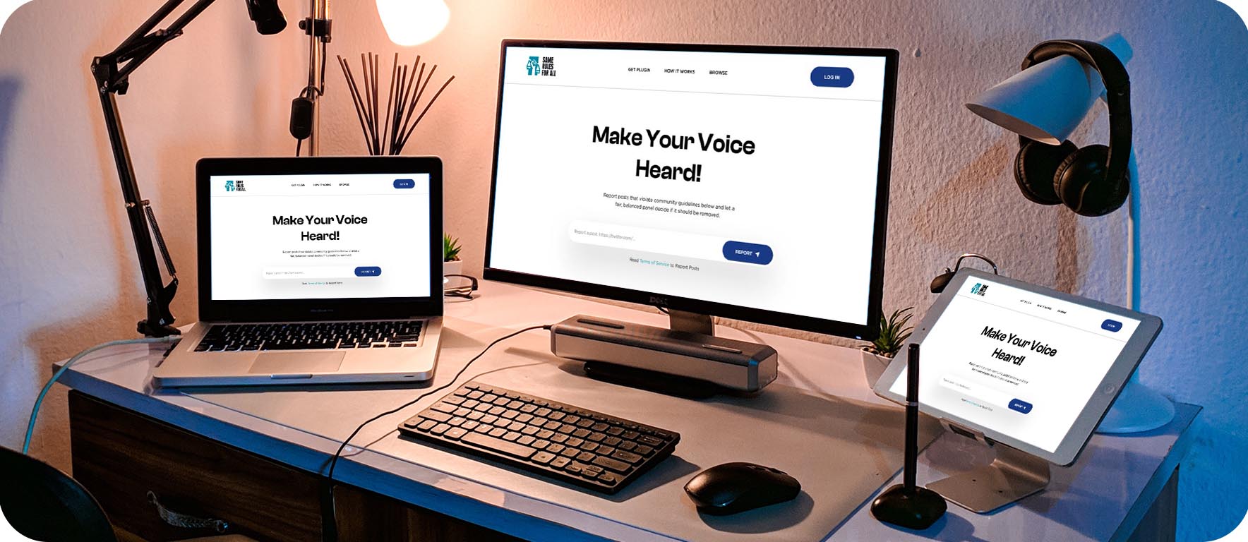
Sleek UI design
A beautiful UI design can increase your conversion rates by up to 200%. It goes without saying that you can’t have a cool product with a boring design. You just can’t!
Your UX/UI design needs to balance all the same intricacies as the messaging. It also needs to meet the middle of the business goals and the user’s needs without being too bland or too intricate.
This sounds like a fine line to walk, but a good UX designer (or team of designers 😉) will know exactly where to implement these digital product design elements into a design that supports the brand identity and the user journey.
As we said earlier, We are VISUAL creatures. Our UX design strategy helps us empathize with our client’s goals and what the users want to see. This takes our digital product designs from just pretty to meaningful, making the product more impactful in the long run.

So, how do I incorporate these into my product?
Building a digital product seems intimidating at first, but knowing what digital product design elements you need gets you off to a great start.
Spend some time brainstorming about what you think the finished product will look like. How would you describe the look and feel? Who are the target users and what do they want? What design elements are there to help them accomplish their goals? Why should they keep coming back to your product?
Asking yourself these questions will help you form a killer UX design strategy to guide you through product creation. Then you can plug in these digital product design elements where they make the most sense.
Whether you need a brand-new product or an existing one redesigned, Create Ape knows how to utilize these digital product design elements to give it that extra oomph.
Still not sure if your product needs a UX facelift? Get a UX Evaluation to see what Create Ape can do for you or start a project with us today!