Design tips for a conversion-centric landing page
UX encompasses everything a user feels when interacting with your website, including the landing pages that convert first-time visitors into your digital acolytes.
Landing pages are critical in online marketing because they can generate leads, promote products, and generate awareness. Think of them as the formal introduction between your site and your user after being directed from search engines, social media, and email campaigns.
The user gets a good idea about your site’s utility through your landing page. A well-designed landing page strategically communicates on behalf of your brand while guiding the user through retention and sales funnels. They’ll remember an easy sign-up experience, and they’ll also remember an annoying and confusing one.
The content on your landing page is key to directing your user. But what good is clear content with a bad layout or distracting design? And what good is an awesome design with cold, boring messaging?
Consider these design elements when building your perfect landing page:
Have a clear goal in mind
Simplicity is the name of the game with landing pages. Know what you want the user to do when they get to the page and make that your only focus.
To accomplish this goal, keep the page as distraction-free as possible. Avoid different calls to action that take the user away from the desired conversion funnel. And avoid outbound links that take the user away from the page entirely.
Having one option on the page narrows down their choices and makes the experience completely unambiguous. Less is more with your landing page.

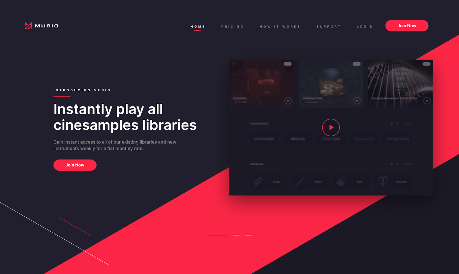
Write headlines that demand attention
The headline is the first thing a user sees when they click on your landing page, and you can communicate so much in just a few simple words. You have only seconds to capture and retain your user’s attention. Keep the messaging of your headlines straightforward and engaging.
Fonts, typography, and color palettes are all essential parts of your branding. Together, they form the big picture of your verbal and visual identity in the user’s mind. Be sure to incorporate these elements into your headline to introduce the user to your brand and uphold your identity.
Keep content short and sweet
This might come as a surprise, but our online attention spans are short.
Big blocks of text turn users away from landing pages. The goal is to give them a quick idea of the page’s function and direct them to the first conversion funnel. Sum up your aim with your headline, brief description sentence, and a clear call to action.
If using extra text is unavoidable, then break it up into easily digestible sections. Divide sections into subheadings that highlight value propositions or create a bulleted list that simplifies a process. Just remember — scannable copy is king.
Only ask for what you need to know
The user does not want to answer a million questions to create a profile or buy something off your website. Keep your forms simple and ask only what you need to know for a quick, frictionless conversion process.
Users are generally more willing to give out their email than their phone number, so asking for an email address first is a great way to start the conversion process. You can also reduce the number of required forms to give the user more control over the contact information they share.
Make your CTAs unignorable
So you’ve roped in your user with an interesting headline and cool layout. Now they need to know where to go next to accomplish their goal.
You need a clear call to action that shows the user how to get to the next conversion funnel. Keep CTAs as succinct as possible so the user knows exactly what will happen when they click that button.
Your CTA needs to be easily identifiable against the other elements in the interface. Using a contrasting color from the background is a great way to focus on the most important parts of the page.
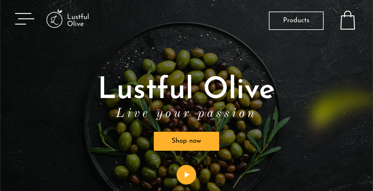
Keep CTAs close enough to the headlines and images — the things that draw the user’s eye right off the bat. If your landing page is long and text-heavy, try to place a couple of different CTAs throughout the page.
Now ramp up the visuals
Your brand's visual identity will guide the overall design of your landing page, but be sure the content and messaging do not get lost in the shuffle.
A minimalist design is a great way to call attention to the CTA but can come off as boring if not done right. Your color palette and images are great accents on a simple landing page. Your landing page should inspire trust and reliability, so make sure images are high-quality and on-brand.
The actual content needs to be the focal point of the page, even on a busy layout. Fonts in contrasting colors help the user separate the message from the rest of the design. Some light shading also helps words pop out against the background. Above all, your CTA still needs to be easily identifiable and optimally placed.

The ultimate landing page checklist
Landing pages have a lot of power in digital marketing. Well-designed landing pages generate excitement for your brand while boosting your sales and conversion rates through the roof. And bad ones have real-world consequences that drive people away from your site, losing you money.
As always in UX, user testing will tell you all you need to know about how the page functions and what needs improving. You won't know for sure how effective the page is until you test it with your users.
Take your design through this checklist for a strong starting point:
- Is the goal of the landing page clear?
- Does the headline draw and keep attention?
- Does the content accurately communicate the page's function?
- Do the forms make the onboarding process too long or frustrating?
- Can I identify the CTA?
- Do I know what is going to happen when I click the CTA?
- Does the design of the landing page accurately represent my brand?
- Does the design distract from the overall purpose of the landing page?
- Is there anything in the interface that would prevent users from completing their goals?
- Will this conversion experience help me retain users?
If your design passes all these questions, it is ready for the real world.
Are you struggling with building your perfect landing page? Create Ape's UX designers know how to make landing pages engaging and conversion-focused. To get started, contact us.