UX Design Memes (and how they Improve your designs)
UX design memes, we know them and love them.
Whether you’re quickly sending one to a coworker or staying up until 3 AM scrolling through them on Reddit, memes are addictive. And UX design memes are a great way for the pros (like us) to relate to each other and share a laugh at the end of a stressful day.
But, what if we told you that you could learn more about the nuances of UX/UI design from memes? (Yes, we were doing a Morpheus impression while typing this.)

It’s true, though. In UX/UI design, we often rely on visuals to demonstrate a point, which is exactly what memes do. Albeit, they do it in a much more amusing way than a pie chart or graph.
These UX Design Memes will show you some special considerations to take before you begin, and maybe give you a sensible chuckle or two.
Design vs User Behavior
Looks only get you so far. What good is a beautiful design if the user has to jump through hoops to achieve their goals? This is the very idea behind behavioral design. If users are cutting corners anyway, meet them halfway and simplify the design as much as possible.

What’s the difference?
We’ve all had a painful discussion with a family member about how UX/UI design is different from web design. Then you have to explain the difference between UX and UI design.
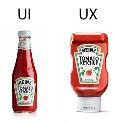
You may have seen this meme floating around, but it draws a clear distinction between the two. One design makes the product easier to use and the other is all about the look. It’s also incredibly helpful in explaining the intricacies of UX/UI design to clients.

Trust the process
Once you get a new project in your hand, you may start to build a big picture in your mind of what the final product will look like. However, jumping straight to HiFi designs is a big no-no.
You need to have a solid foundation laid out to build a product that actually works. Understand what the stakeholders want and what the user needs, create some sketches and wireframes, and gather some feedback to validate your design decisions. Otherwise, the experience of using the final product will feel a little hodge-podge.

Research, research, research
A cool, creative design helps your company stand out from the competition. But if it creates new pain points for the user, it does more harm than good. User research and testing are crucial in avoiding problems post-launch, so spend plenty of time on them and don’t rush.

Inspiration, not imitation
They say imitation is the sincerest form of flattery. Your users and stakeholders will already have brands they gravitate towards — but directly copying your competitors won’t help your digital product design stand out to your users.
That’s not to say you can’t take inspiration from your competitors, but you need to change things enough to create a unique product. Think about Tinder and Bumble…they’re pretty similar apps, but what features or design elements draw users to one over the other?
Plus, UX design memes that use Obi-Wan Kenobi are always cool by us 😎

Is it ever really “Done”?
We’ve said it before and we’ll say it again, the product launch is just the beginning! User testing and iteration gets you a minimum viable product (MVP), but there’s always room to improve the product after it hits the market. Don’t be afraid to think long-term when you’re designing.
Remember, the UX design process allows you to revise and refine at any point. Use that to your advantage!

Ditch the dark UX
What’s good for boosting conversions is good for the user experience, right? WRONG!!!
Yes, increasing conversions (either through product sales, demo requests, collecting emails, etc.) is the goal for most stakeholders. But effective UX designs have to take that and the user’s feelings into consideration.
Dark UX patterns get those precious conversions, but they don’t convert those users into long-term brand loyalists.
Focus on creating a satisfying experience for the user instead of instant gratification for the stakeholder.

Learn from your surroundings
UX design is a modern practice, but the concept behind it is as old as time. Think back to the invention of the wheel. How much easier did it make life in ancient Mesopotamia? How has the speed and efficiency of the wheel improved since then?
When you realize how UX impacts every single product you touch (in person or online) it becomes easier to empathize with everyday users and apply those practices to the digital products you create.

Don’t force account creation
Say it with us… “Checkout as a guest” is your friend!
This specific meme is about applying for jobs, but it applies to almost all digital products. No one wants to take extra time to create an account when they just want to buy something or fill out a form.
In fact, 23% of users abandon the conversion funnel when they’re forced to create an account, so save some trouble and leave it out.

Save to camera roll
UX design memes are a great way to unwind and pass the time. But if you look a little closer, you can learn a thing or two from them.
So when you’re prepping for a new project or conducting some research, keep a close eye on Instagram or your favorite Reddit thread. You may just get some insight into user behavior or UX strategy.
Want to work with a meme-savvy team that makes the UX design process fun? We’ll have a good time while giving your product a look and feel your users will love. Start a project with us today!