


When a phrase like “WCAG 2.0 Compliance” is mentioned, you probably feel your eyelids beginning to droop. But compliance is a serious matter that has serious legal consequences if not taken in a serious manner – and nobody is above the law.
Throughout the existence of the Americans with Disabilities Act (ADA), lawsuits have been brought forth that have cost companies millions of dollars. Even the United States government is susceptible, with three administrative complaints being filed under Section 508 of the Rehabilitation Act in 2009 alone.
Almost 15% of the world’s population lives with some form of disability, and their user experience is just as important as everyone else’s. Compliance with the standards set by ADA and Section 508 ensures that they can patronize your website without difficulty.
Here at CreateApe, we take compliance very seriously. Creating an atmosphere of inclusion and accessibility for all isn’t just something we’re bound to do — it’s something we’re compelled to do because it’s simply right. That’s why we always think compliance-first at every stage of design and development.
So…What is It?
The World Wide Web Consortium (W3C) has developed guidelines for accessibility on the internet called “Web Content Accessibility Guidelines” (WCAG) 2.0. These guidelines give recommendations for making web content more accessible and usable for people with various disabilities, including blindness, deafness, learning disabilities, limited movement, and more.
Both Title III of the ADA and Section 508 of the Rehabilitation Act use the WCAG 2.0 guidelines as a standard. Section 508 governs federal websites and anyone doing business with the government while the ADA applies to all websites as they are considered places of public accommodation.
In a nutshell, the WCAG 2.0 sets standards to make the web more accessible to people of all abilities. There are 38 different success criteria, regulating things like proper color contrast, usage of alt tags for pictures, keyboard navigation, and limitations on flashing images. And that’s just the tip of the iceberg.
The gist of things is if you don’t make things accessible, then you’re discriminating against those with disabilities, and it could cost you.

It’s a Jungle Out There
The last couple of decades is littered with lawsuits over ADA and Section 508 violations. According to a UsabelNet study, 2235 ADA website lawsuits were filed against companies in 2019. 21% of these companies were sued more than once.
Even celebrities aren’t immune to ADA lawsuits. Queen Bey herself stood accused of noncompliance. Some elements of the lawsuit included:
- No alt-text on images. Every image on your website must include an element called an “alt-tag” which helps screen readers describe what the image is displaying. Those bongo drums you’re selling need alt text or else there would be no way to determine what is on the website or make purchases.
- No accessible drop-down menus. Without drop-down menus, people with visual impairments are unable to select the size or quantity of products they’re looking to buy.
- No keyboard access. Screen reading software relies on keyboard movement to aid website navigation.
In 2009, Target Corporation had to pay out $6 million in damages and more than $3 million in legal fees to settle a lawsuit brought forth by the National Federation of the Blind. Among the complaints were that an image of a Dyson vacuum cleaner had alt-text that was read by a screen reader as:
Link GP browse dot HTML reference zero six zero six one eight nine six three eight one eight zero seven two nine seven three five 12 million 957 thousand 121
Say that out loud to yourself and listen to how ridiculous it sounds.
Winn-Dixie, Domino’s, Fox News, Burger King, Nike, Blue Apron, CVS, Hobby Lobby, and Harvard are just a small fraction of companies and organizations that have faced legal challenges for violating the ADA. The list goes on.
Government departments and agencies have also been sued. The Department of Education, the Small Business Administration, and the Social Security Administration have all received accessibility complaints under Section 508. Ironically, the National Museum of Crime and Punishment in Washington D.C. also had to fix some of their website features.
How to Avoid the Banana Peels
That was a lot to take in. Deep breaths. In and out, in and out…
It’s important to know the gravity of what non-compliance means, but there are some simple steps you can take to ensure that your website is accessible and you don’t step in any mud. Here’s a checklist for you to follow to help you meet the WCAG 2.0 guidelines at the AA level:
Alternatives
- All images and non-text content need alt text.
- All video and audio-only content needs a transcript and closed captioning.
Presentation
- Use proper markup techniques to structure your website’s content.
- Present content in a meaningful order so that it reads properly.
- Make sure that all detailed instructions aren’t reliant on a single sensory ability.
- Do not rely on color alone to convey information.
- Audio must be able to be paused, stopped, or muted.
- There must be a color contrast ratio of at least 4.5:1 between all alt text and background.
- Do not use images of text unless necessary.
User Control
- All functions and website content must be accessible by a keyboard without the use of a mouse.
- Blinking, scrolling, and moving content must be able to be paused, stopped, or hidden by a user.
- Any content or imagery cannot flash more than three times per second.
Understandability
- Pages should have a descriptive title.
- Users must be able to navigate in a logical reading order that preserves meaning.
- Each link should have a clear purpose based on anchor text.
- Website language should be able to be changed.
Predictability
- Navigation should remain consistent throughout all pages.
- Form errors should be easy to identify, understand, and correct.
- All forms and input fields should be unambiguously labeled.
This is by no means an exhaustive list, but it’s a start. We know, it’s a lot to keep track of. Website accessibility is an on-going and long-term project. As your content and designs evolve, you must always make sure that you remain ADA and Section 508 compliant. We promise, it is doable.
Let Us Guide You Through the Forest
If the above steps sound overwhelming to you, don’t fret. We’re here to help by either providing an action plan for you to follow or by taking the lead with a full-fledged compliance analysis. Either way, our goal is to give you peace of mind.
Some of the strategies we use include:
- Brainstorming of clear layouts and distinct calls to action to help users navigate easily
- Ideation of robust designs that can accommodate a wide variety of users
- Embracing a human-centric approach to ensure that the design will be perfectly suitable for everyone
- Evaluation of the current style sheet with small edits, if necessary, to increase accessibility
- Planning of a fluid, accessible, and easy-to-navigate architecture
- Automatic screen-reader adjustments powered by AI
- Automatic keyboard navigation adjustments
- The ability to freeze all animations, GIFS, and flashing images
- An online dictionary that allows for the search of phrases, abbreviations, and concepts
- Quick navigation to let users reach any important page with a single click
- Font replacement & adjustment to ensure easy, effortless reading
- Analysis of existing elements to discover pain points that need improvement
Are you a business owner or entrepreneur that needs help with compliance? Let us assist you in getting #JungleReady. Our CreateApe expert team will be your jungle guide and help you traverse the wilds as we take your project to new heights.

Color is known to be a significant determinant for both website trust and satisfaction. Color has the potential to communicate meaning to the user and influence their perception through the priming effect, how the exposure to one stimulus influences the way we will respond to another stimulus. In that way the exposure to a certain color can influence the visitor’s reaction towards the site in a carryover effect, meaning that the emotional reaction towards a color can be translated into a positive or negative interaction with the website.
Color Psychology
Perhaps you think the color of your website should reflect your personality. But if you don’t take color psychology into account, you’re missing a valuable opportunity to brand your e-commerce store effectively and drive customer engagement. Here’s the (generalized) psychology breakdown of the color spectrum, ROYGBIV, plus a few bonus colors thrown in:
- Red signals: attention, excitement, anger, love, warmth, comfort, life
- Orange signals: enthusiasm, fascination, happiness, creativity, determination, attraction, success, encouragement
- Yellow signals: adventure, happiness, competence, enthusiasm, wealth, sophistication.
- Green signals: Balance, good taste, health, money, harmony
- Indigo/blue signals: Honesty, corporate, high-quality, masculinity, competence, loyalty, trust, reliability
- Violet and purple signal: Creativity, authority, rower, royalty, respect, mystery
- Pink signals: Love, compassion, sophistication, sincerity, romance, gentleness
- Brown signals: Friendliness, ruggedness, sadness, comfort, organic, natural
- Black signals: Grief, sophistication, expensive, intelligent, slimming
- White signals: Simplicity, order, innocence, purity, cleanliness and neutrality
- Gray and silver signals: Timelessness, practicality, neutrality, refinement and the quality of being contemporary
Now that you’ve got the colors’ message under your belt, next think about your ideal customer and the brand message you want to convey.
For instance, if you have an extreme sports e-commerce, you’ll probably want to stay away from pink…
But I love pink…
All that being said, sometimes the specific color used isn’t as important as the context with which it’s being presented.
One of our retail clients ran an A/B test to learn about the effectiveness of one color compared to the other. The results were conclusive: A blue CTA increased the conversion rate by 20 percent. These results might lead most designers to conclude that a blue CTA leads to higher conversion rate compared with the red one and to implement this knowledge in other websites.
However. a deeper look at “mouse move” heatmaps uncovered that the difference in conversion was due to the buyer state of mind, rather than due to the CTA color. Visitors that did not convert show a different pattern of behavior. They were more details oriented, spending a longer time on every piece of information, and their engagement time was significantly higher.
On the other hand, visitors who converted tended to be more impulse buyers and spent less time on the page and were less focused on the details.
The only thing we can say is that the red CTA button is more appropriate to the “impulsive buyer” than the blue one. Thus, color alone can’t explain the variance in the visitors’ behavior. The attractiveness of a certain color is determined by its context and not by a visitor’s preference to specific color.
Sound confusing? That’s why you hire a skilled UX/UI design team to guide you through the process. We will help you identify your contextual needs and offer you the best color choices for your user goals.

There are many tools in a UX designer’s tool kit, and Crazy Egg is one of our favorites. Crazy Egg is a website that allows designers to track various types of data on their designs. Two of their most prominent features are their heat mapping and A.B. testing tool. Today, we’re discussing why it’s important to use these critical insights in UX design.
Mapping Designs is Essential
There are various types of maps that UX designers use to strengthen their designs. Scroll maps, for example, show where the user is scrolling and where they tend to stop. Confetti maps show which areas of the site are getting the most clicks and which are not. Heat mapping shows where users have clicked the most on a website, what pages they’re visiting, and what designs they’re responding to. This data is also broken down by where the traffic is coming from and browsers used. Whether we’re using heat mapping, confetti mapping, or scroll mapping, these insights help us interpret how users are behaving and allow us to design accordingly.

Data Reveals Crucial Insights
In a world that’s saturated with data, it’s important to understand the crucial insights and how to know which numbers to pay attention to. Understanding data from the mapping is one thing, it doesn’t take an analyst to understand that where the most saturation is on a heat map is where the user is visiting most frequently, but it does take technical and creative skills to implement data into a design that converts.
“Crazy egg provides additional levels of data for the savvy UX designer. Breaking down traffic through heat and confetti maps allow the designer to ascertain real data regarding user activity,” comments our CEO Alessandro Fard.

Increased Certainty
The maps on Crazy Egg give us more certainty. Because we do projects from a variety of different verticals, there’s no certainty that one business user will respond like others. This gives the design a far stronger chance of survival. Think about it like genetics. If we keep tracking the things that are working and making improvements to the designs’ DNA, it’s survival of the fittest. This gives our designs a competitive edge and gains traction with customers. When you stumble upon insights that make a huge difference in how responsive your design is, we clutch them tight and never want to let them go.
The great thing about mapping is that it offers insights that allow designers to make changes that aren’t a shot in the dark. There are no longer ambiguous insights and it doesn’t feel like playing Russian Roulette with your designs.
Gone are the days of trial and error to see what actually works. We no longer need to conduct dozens of tests to see what’s working and what’s the most impactful. Don’t get us wrong, testing designs is essential and one of the most important aspects of UX, but it’s no longer just based on luck. We see this with A.B. testing.
A.B Testing
Crazy Egg is one of our go-to user research tools. We use it with most strategic redesigns and pivots. Not only does if offer heat mapping to see where we need to make changes as designers, but we get to test the capability and impact of our designs with A.B. testing.
A.B. testing is when you test designs to see which one the user responds to the most. This could be small changes like testing the responsiveness of the color of a button, or more complicated designs like an entirely different landing page.
We see this a lot with how personalized websites are becoming. There are now various landing pages that are designed to be used on different types of people or personas. A.B. testing allows the designer to see which landing pages are the most impactful for a certain demographic.
Alessandro comments, “Using the crazy egg A.B. testing feature, you can observe the impacts of testing variations to a page such as button placement, color, wording, etc. The crazy egg tool is also fairly simple and powerful and has been built to not overwhelm users.”
A.B. testing can clue us into small changes that translate into bigger metrics. For example, one thing we constantly see are people clicking on the feature images when they aren’t clickable elements. People were clicking them anyway and it gave us a tip as to what users found valuable on the page. These small insights allow us to change things like copywriting and placement that ultimately results in boosting conversion rates.
The Tool Kit
After all, UX is a blend of art and science. It takes a skilled designer to know how to implement both aspects of UX in a way that is meaningful and responsive. Thanks to Crazy Egg, we can continue to deliver products to our clients that are supported by data and show clear results. The simplicity of their product combined with the immensely impactful insights Crazy Egg offers is essential for any UX designers tool kit.

New UX design trends are emerging all over the place, and it’s that time of the year when we can gauge which ones will make the biggest impact in the new year.
It’s never too early to pop the champagne and start drawing up the new year’s resolutions for your business. More page views? More conversions? A brand new look for your digital product? All this and more are achievable by working these new UX design trends into your interface.
Our Top UX Design Trends for 2023
- VR/AR
- “Scrolly”telling
- Interaction Design
- 3D Graphics
- “Nostalgic” Design
- Smarter Chatbots
- Accessible Design
- Mobile-First
2022 Trend Review
Before we get too deep into what’s to come, let’s see how 2022’s UX trends fared.
In our blog last year, we predicted that dark mode, abstract data visualization, voice AI, personalized interfaces, and bold colors and fonts would reign supreme. We certainly used them a lot in our own UX designs this year.
We expect these trends to linger around for a while, especially with the influx of AI technology available to UX designers. In fact, we can see a lot of these being used in tandem with our favorite emerging trends.
1. Dark Mode
About 82% of smartphone users reported using dark mode in 2022, and several digital product designers took notice. This trend remains a favorite for many reasons — either to save battery life, focus on content, or purely for aesthetic purposes.
2. Personalization
Users also heavily gravitated towards personalized experiences despite privacy concerns. 90% of consumers favored the idea of personalization, while 72% stated they ONLY engaged with personalized messaging this year.
The trick is to personalize interfaces and content meaningfully, building the interface around information the user willingly shares with you. This doesn’t mean you should present ads for products after a user mentions them in conversation or walks by a storefront (*cough* Facebook *cough*).
3. Voice AI
While only 47% of adults in the US use voice AI, that number is expected to grow by 2025. AI technology is rapidly refining and expanding into industries like business, manufacturing, healthcare, and even E-commerce. We expect to see voice AI incorporated into interfaces also utilizing CVT (computer vision technology) and ML (machine learning).
4. Bold Colors & Fonts
While no statistics prove that users prefer bold colors and fonts to more subdued ones, this study by Relevance shows that colored visuals increase the user’s willingness to read content by 80%.
When designers use color psychology to their advantage, they can create a singular brand experience that invites users in and gets them invested in their product. Read more about color psychology in our Brand Marketing blog!
5. Abstract Data Visualization
Same as the bold colors, there’s no conclusive evidence showing that users prefer abstract data visualizations to basic charts and graphs. However, the same study from Relevance shows that 65% of people are visual learners and that images drive engagement by 180%.
Since abstract data visualizations allow users to process information and understand the significance of data faster than text, they’re still a solid choice for any highly-visual UX design.

Our predicted UX trends proved their true value in 2022. But will these new UX design trends for 2023 dethrone them? Or will they join houses to create a harmonious user experience?
Top 8 UX Design Trends for 2023
New year, new you, new products! UX is always evolving, but some trends are a cut above the rest. These are the UX design trends we expect to see more of in 2023.
1. Virtual/Augmented Reality
If an oculus is on your holiday wishlist, now is the time to splurge! Virtual reality caught on in a big way in 2020 for…obvious reasons. Since then, its expanded beyond gaming and many companies have added VR experiences to their digital products.
From travel to fitness, there are plenty of ways to get creative with VR and AR. It gives the user an immersive sensory experience and makes them feel more involved with your business.
One of the best examples of VR utilization comes from National Geographic with their Explore VR. It perfectly suits their niche, as it’s an engaging educational experience for their loyal readers and travel enthusiasts alike.

Explore VR helped people satiate their travel bug during the pandemic while learning more about cultures around the world. National Geographic’s brand and the user’s goals perfectly intersected with this VR offering. Think about ways to enhance your brand experience using VR/AR this year.
2. “Scrolly”telling
Motion design is all the rage right now (we’ll get into that a little later), and it amps up one of the most rudimentary elements of your page. Instead of limiting the use of scrolling to content order, you can use simple animations to bring your interface’s navigation to life.
Scrolling allows you to present stories and content in a way that draws users in and gets them excited for what’s next. With animations, you can convince them that they’re seeing fresh content instead of mindlessly scrolling through the page.
Plus, a lively scrolling experience can call attention to the most important elements on the page. This allows designers to structure images, videos, and website copy in a way that tells a story and isn’t hyper-focused on the goals.
3. Interaction Design
In the most basic terms, interaction design is described as the interface interactions between users and digital products. Anything from the design itself to motion and sounds fall under the umbrella of interaction design.
It sounds broad — but in the last year or so, designers started honing in on what the user sees while interacting with the product. So it’s easy to see why UX and interaction design overlap so well because human interaction (with a mouse, finger, or stylus) is a huge part of the user experience.
Consider how the user interacts with your product (desktop, mobile, wearable device, etc), the physical objects they use in the interface (scroll, CTAs, images, or videos), and the appearance and timing of motion or sound feedback.
These considerations make your product more usable and goal-oriented.
4. 3D Graphics
Corporate 2D illustrations are nice enough to look at, they’re starting to feel a little stale. You can’t throw a stone on the internet without hitting a website that uses the same art style. Your product needs good visuals, but what do you do when images, videos, and 2d animations aren’t enough?
Advancements in coding and 3D animation software (like Spline, Maya, and Adobe 3D Animation) help designers create animations and elements that feel like they could jump right off the page. And with the growing trend of VR, the demand for 3D animation is going up.
You don’t have to be a Pixar-level 3D animator to incorporate this UX design trend into your interface. Like microinteractions, you can find subtle ways to use 3D graphics in your designs. Using things like soft shadows and overlays can make your digital product graphics feel much more dynamic.

5. "Nostalgic" Designs
Who doesn’t love a good throwback?
Going retro may feel like a risk since it’s harder to gain the user’s trust with a visibly outdated website. But when used correctly, vintage design elements can elicit some warm, fuzzy, nostalgic feelings from the user.
With so many art and design styles over the last century, there’s no shortage of inspiration to pull from. Pick one that suits your brand identity to make your design feel more grounded and purposeful.
Here’s an excellent example of nostalgic web design from Bathtub Gin. Everything from the name to the logo and art deco border design evokes prohibition-era vibes. It screams “Speakeasy,” which is exactly what they’re trying to promote.

Also, we’re nothing if not cool, trendy apes. If the kids want to bring back some Y2K aesthetics, lean into that. Just don’t make your website look like Myspace or an AOL chatroom.
6. Smarter Chatbots
Chatbots are an excellent tool that all businesses should use because they take a lot of pressure off customer service representatives and provide a more comfortable experience for the user.
With the advancements in AI and ML we mentioned earlier, chatbots are becoming more intuitive by learning from user interactions and becoming more conversational. This, in turn, leads to the user experience feeling more personalized and satisfying.
About 1.4 billion people use chatbots to ask questions or solve problems quickly, and that number will grow with this rising UX design trend. Take advantage of this user-friendly tool to handle common queries and simplify the user experience.

7. Accessible Design
Some things will never go out of style. Designing for accessibility is one of those things.
Designing with ADA compliance in mind has always been important for UX designers. Not just to avoid legal action — but to ensure that your product is usable for everyone in your audience, regardless of their abilities.
On the heels of a mass disabling event like the COVID pandemic and the incorporation of wearable technology in everyday life, designing for accessibility is more important now than ever. UX designers and developers should always be aware of the latest guidelines to keep their products compliant.

There are plenty of free resources online to read up about ADA compliance and Web Content Accessibility Guidelines. Familiarize yourself with the most recent version before you start designing.
8. Designing Mobile-First
We’re always on the go, and UX designers have taken notice. Many companies are starting to build their products mobile-first to accommodate our busy lifestyles.
This is slightly different from mobile-only apps. There’s usually an accompanying desktop version, but the design is built for someone that’s up and moving (instead of sitting in a big, comfy office chair) and probably only using their thumb to navigate the interface.
On top of making the product accessible in multiple scenarios, it also helps the overall design be more responsive. Plus, less code=less bugs — and less bugs=less time spent on website maintenance.
You would also think that a smaller canvas would mean less room for creativity, but that couldn’t be further from the truth. It actually allows you to streamline your content and present the brand’s story in a way that helps users accomplish their goals quicker (fostering a deeper connection between your brand and your user).
Which Trends Are You Most Excited For?
Taking in all these new trends can seem intimidating at first. But once you understand why users gravitate towards them and how they can benefit your product designs, they can really get the creative juices flowing.
Before 2022 turns into 2023, think about how to use these trends to give your product a facelift. How would your users respond to a VR experience for your language learning app? What about a Y2K throwback for your e-commerce brand? Or new 3D illustrations for your data entry product?
Both your brand and your digital product should be ever-evolving. Don’t risk a dated user experience...study up on these trends to keep your interface as fresh and exciting as when it launched.
Does your digital product need a new look for 2023? Start a project with us today!

UX design memes, we know them and love them.
Whether you’re quickly sending one to a coworker or staying up until 3 AM scrolling through them on Reddit, memes are addictive. And UX design memes are a great way for the pros (like us) to relate to each other and share a laugh at the end of a stressful day.
But, what if we told you that you could learn more about the nuances of UX/UI design from memes? (Yes, we were doing a Morpheus impression while typing this.)

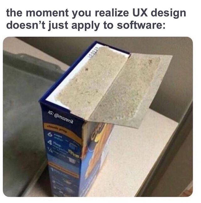
It’s true, though. In UX/UI design, we often rely on visuals to demonstrate a point, which is exactly what memes do. Albeit, they do it in a much more amusing way than a pie chart or graph.
These UX Design Memes will show you some special considerations to take before you begin, and maybe give you a sensible chuckle or two.
Design vs User Behavior
Looks only get you so far. What good is a beautiful design if the user has to jump through hoops to achieve their goals? This is the very idea behind behavioral design. If users are cutting corners anyway, meet them halfway and simplify the design as much as possible.

What’s The Difference?
We’ve all had a painful discussion with a family member about how UX/UI design is different from web design. Then you have to explain the difference between UX and UI design.
You may have seen this meme floating around, but it draws a clear distinction between the two. One design makes the product easier to use and the other is all about the look. It’s also incredibly helpful in explaining the intricacies of UX/UI design to clients.
Trust The Process
Once you get a new project in your hand, you may start to build a big picture in your mind of what the final product will look like. However, jumping straight to HiFi designs is a big no-no.
You need to have a solid foundation laid out to build a product that actually works. Understand what the stakeholders want and what the user needs, create some sketches and wireframes, and gather some feedback to validate your design decisions. Otherwise, the experience of using the final product will feel a little hodge-podge.

Research, Research, Research
A cool, creative design helps your company stand out from the competition. But if it creates new pain points for the user, it does more harm than good. User research and testing are crucial in avoiding problems post-launch, so spend plenty of time on them and don’t rush.

Inspiration, Not Imitation
They say imitation is the sincerest form of flattery. Your users and stakeholders will already have brands they gravitate towards — but directly copying your competitors won’t help your digital product design stand out to your users.
That’s not to say you can’t take inspiration from your competitors, but you need to change things enough to create a unique product. Think about Tinder and Bumble…they’re pretty similar apps, but what features or design elements draw users to one over the other?
Plus, UX design memes that use Obi-Wan Kenobi are always cool by us 😎

Is It Ever Really “Done”?
We’ve said it before and we’ll say it again, the product launch is just the beginning! User testing and iteration gets you a minimum viable product (MVP), but there’s always room to improve the product after it hits the market. Don’t be afraid to think long-term when you’re designing.
Remember, the UX design process allows you to revise and refine at any point. Use that to your advantage!

Ditch The Dark UX
What’s good for boosting conversions is good for the user experience, right? WRONG!!!
Yes, increasing conversions (either through product sales, demo requests, collecting emails, etc.) is the goal for most stakeholders. But effective UX designs have to take that and the user’s feelings into consideration.
Dark UX patterns get those precious conversions, but they don’t convert those users into long-term brand loyalists.
Focus on creating a satisfying experience for the user instead of instant gratification for the stakeholder.

Learn From Your Surroundings
UX design is a modern practice, but the concept behind it is as old as time. Think back to the invention of the wheel. How much easier did it make life in ancient Mesopotamia? How has the speed and efficiency of the wheel improved since then?
When you realize how UX impacts every single product you touch (in person or online) it becomes easier to empathize with everyday users and apply those practices to the digital products you create.
Don’t Force Account Creation
Say it with us… “Checkout as a guest” is your friend!
This specific meme is about applying for jobs, but it applies to almost all digital products. No one wants to take extra time to create an account when they just want to buy something or fill out a form.
In fact, 23% of users abandon the conversion funnel when they’re forced to create an account, so save some trouble and leave it out.

Save To Camera Roll
UX design memes are a great way to unwind and pass the time. But if you look a little closer, you can learn a thing or two from them.
So when you’re prepping for a new project or conducting some research, keep a close eye on Instagram or your favorite Reddit thread. You may just get some insight into user behavior or UX strategy.
Want to work with a meme-savvy team that makes the UX design process fun? We’ll have a good time while giving your product a look and feel your users will love. Start a project with us today!

I always say that UX inspiration comes from the world around us, and we can learn a lot from websites we’re constantly browsing. When planning for my summer vacation brought run-ins with countless hotel timetables and booking forms on travel websites, I paid attention to what worked and what didn’t. What was easy to use and what was simply annoying? I took notes on what made me exit the browser and what made me stay booking with certain companies.
Here’s what I learned.
A Quick lesson on UX/UI Usability
The travel websites I used the most had nailed the value of usability in User Experience. Although usability is a quality of User Interface (how easy something is to use), it’s also one of the many aspects of User Experience that involves “everything that affects the experience of the user.” According to the UX research firm Nielsen-Norman Group usability consists of five main goals: learnability, efficiency, memorability, errors, and user satisfaction.
Learnability:
How easy is it for users to follow a desired action? Can they accomplish basic tasks the first time they see the design?
Efficiency:
How quickly can tasks be performed?
Memorability:
If leaving and returning later, how quickly can they remember how the site works?
Errors:
If the user makes a mistake in the desired user flow, how quickly can they recover?
Satisfaction:
How pleasant is it to use?
These factors were what I used to determine whether a site was ultimately, easy and pleasant to use or just didn’t make the cut. As I browsed the void of travel websites (trust me there’s a lot out there) the best had the following features:
Where to Start
Planning vacations can be overwhelming, that’s why websites that gave me a place to start were automatically winning in the UX department. If a website is easy to use, it should be easy to navigate. Websites with a clear indication of where to start on the homepage took the stress out of planning a vacation. Since the homepage is usually the place with the most interaction, placing engaging and foolproof content will keep visitors intrigued and wanting to use your site.

Airbnb knows that its users are going to their website to find a place to stay in any desired location. In response, they placed a straightforward search engine on the top of their homepage, effectively keeping their site simple and easy to use. If you know where you want to go, it’s easy to search for places to stay, and if you’re a spur of the moment person, suggestions are right below the navigation. If you haven’t picked a destination yet, Airbnb prompts suggestions of homes you might like.
High Impact Imagery
You’re lying to yourself if baby blue water and resort photos don’t draw you in. Especially on travel websites, high impact imagery sells the experience. Instead of stock photos, select imagery that is reflective of the brand and services that motivate users rather than bores them. If the call to action isn’t strengthened by an image, it’s not the right photo. Imagery is supposed to evoke emotion from the users, and websites that showcased beautiful scenery made me want to book with those companies.

Lonely Planet utilizes high impact imagery throughout their entire homepage which inspires users to choose a destination. It also offers suggestions on what to do in those locations.
Simplicity
Travel websites often evoke an overwhelming feeling. So many options, so many deals, right? I immediately clicked out of any browser that was crowded and confusing, or cluttered with a thousand images and CTA’s. For user experience, “less is more” is a phrase to live by. Focusing on relevant information and keeping things simple is easier for viewers to follow a desired user path.

HomeAway doesn’t overwhelm the user with a thousand different pictures and navigation options. Their CTA is made more impactful with it’s simplicity.
Clear Navigation
With so many travel websites out there, it’s hard to differentiate and understand all the services one company offers just by looking at the homepage. That’s why having a clear navigation is essential. Navigations aren’t always self explanatory. Having clear categories that are recognizable can increase function on your site.

At first glance, TripAdvisors homepage looks like its only service is to help users find hotels, but it’s navigation clearly indicates where users can click to find out about other services. We naturally want to categorize and having sections to easily search on a navigation makes using travel websites all the more pleasant.
Easy to Use on Desktop & Mobile
If a travel website didn’t have an as equally easy to use mobile pairing, I didn’t use it as much. Given the nature of the demographics who use travel sites, often times it will be used in a mobile setting It’s important when visiting a site that they tackled their standing on both mobile and desktop. It’s even more important now than ever with Google changing its indexing and ranking to have prioritizes those sites with an exhaustive mobile platform. Since travel prices fluctuate so frequently it was nice to be able to open my phone and check what was available for what price while I was on the go.
Overall, the easiest sites for me to use were simple, innovative and clear. Although I was merely booking vacations, jumping from website to website revealed the necessity for UX. Instead of being frustrated browsing through a site that’s overwhelming, the travel industry is learning what increases conversions and customer experience overtime.
Let’s Work Together!
It’s a jungle out there — let the Create Ape experts help you traverse the wilds as we take your project to new heights.


