


A good UX Design Strategy is essential to a successful digital product. How many businesses actually strategize with their users in mind, though?
At some point in the last 10 years, you’ve probably heard someone say “There’s an app for that”—and it’s true! Companies big and small identify gaps in the market and create innovative digital products to satisfy a need of their consumer. But, how many of these products live up to their promises?
There’s no shortage of digital products on the market today. If you want yours to stand out, the user experience needs to be as good as the idea. That’s where UX design strategy comes in!
UX design is fundamental in creating user-friendly websites and apps, but the perfect digital product doesn’t spring up from the ground overnight. The most effective products usually have a solid groundwork of research, evaluation, and ideation before designing even begins.
So, what is UX design strategy? And what’s in the secret sauce that makes this process so effective? CreateApe is here to show you how to lay the groundwork for the perfect product.
CreateApe’s UX Design Strategy
- Define business strategy
- Identify/interview stakeholders
- Competitive research and analysis
- Ideation
- Design goals
- User research and iteration
- MVP
What is UX Design Strategy
UX Design strategy is a detailed plan for building a digital product that keeps the user experience aligned with the business goals of the company. This strategy is shaped by both qualitative and quantitative research about the users, stakeholders, and competitive market.
In the book UX Strategy, author Jamie Levy came up with a formula for the four tenets of UX strategy:
Business strategy + value innovation + validated user research + killer UX design = UX strategy.
The Four Tenets of UX Strategy
- Business Strategy - These are the company’s guiding principles for how it will position itself in the competitive market and still achieve its objectives. For long-term success, the company must continuously identify competitive advantages and find ways to leverage that against competitors.
- Value Innovation - This happens when companies align newness with utility and price. The combination of these three creates a lasting impression on the user and assigns value to the business.
- Validated User Research - Verify the solutions and confirm that the user will find value in the product. Go beyond observing and empathizing with the user and focus on getting direct, honest feedback from interacting with the product.
- Killer UX Design - A UX designer, strategist, or agency creates the design of the product based on the first three tenets and weaves UX into all online and offline touchpoints—creating a truly frictionless experience. (P.S. This is where CreateApe comes in. Wink wink nudge nudge.)

To get the best results, there should be a robust research and planning phase for every new product, service, or feature released by the company. This gives the UX designer critical insight into solutions that work for the user and the business.
Why is UX Design Strategy Important?
Obviously, it’s best to have a plan in place before starting a project. But why is a UX strategy so important for businesses creating digital products? Besides the potential to create game-changing services and features, a solid UX design strategy gets everyone in the organization on the same page and helps prepare for potential curveballs along the way.
Benefits for the Business
Creating a product that’s validated by the user is the best way to stay ahead of the competition. About 74% of businesses agree that UX is critical for driving sales, but only 55% of companies conduct usability tests with their users.
Testing with the intended user shows that your company cares about creating solutions that people feel good about using. An easy and engaging experience also inspires loyalty in the consumer. If they know they can accomplish a task in 10 seconds with your product, then they’ll keep coming back for more.

Ex: When a business knows exactly who its users are and what they need, it’s easier to empathize with them and build successful products that people feel good about using.
Aside from making the user feel good, a thoroughly planned UX strategy can also come in handy to impress investors. It goes deeper than outlining business goals and instead illustrates how you’re going to satisfy users with measurable goals.
Benefits for the Internal Team
Think of the UX design strategy as a plan of attack for an entire project. Each team member will have their own tasks to achieve each measurable goal, but the overall strategy is designed to keep the team organized and on track.
When the entire team understands users’ needs, more time can be spent on the actual design of the product. Designers will be able to align project goals with technological capabilities, leaving them more time to create a streamlined experience and iterate it to perfection.
Benefits for the User
The popularity of UX only means one thing for the users…better products all around! There are plenty of statistics to show businesses the value of a good user experience. At the end of the day, a better product for you=more money for them.
With the abundance of digital products to choose from, you’d think businesses would rush to get their idea to market. Many do just that, but it only leads to short-term gratification until a competitor inevitably releases a newer, better product.
UX design strategy forces companies to think user-first instead of profit-first if they want long-term success. If a business wants to stay ahead of its competitors and keep consumers coming back for more, they need to invest the time and funds into quality products.

The Dangers of No UX Strategy
It’s safe to say that without a UX strategy, an entire project will crash and burn, right? Well, not RIGHT away, but the difference will be noticeable.
Without a strong understanding of your users and competitive market, digital product design becomes one big guessing game. There’s no data to show that the solutions will actually work for the end-user, making it harder to reach an MVP or driving the user away entirely.
Many businesses think that gathering data post-launch is the way to go. However, statistics show that 79% of users will immediately leave a product if they don’t like what they see. 30% of users will even abandon a brand they like over one bad user experience.
It’s always possible to win back customers down the line, but a lack of UX strategy can be a major blow to a company’s productivity. After all, what’s a house without a solid foundation? And what good is an awesome idea executed poorly?
Creating and Executing a UX Strategy
So, you want to build an awesome product that your users will go bananas over, but don’t know where to start? Unfortunately, there’s no one foolproof UX strategy that will work for every product. Different products have different users, meaning different goals and KPIs.
Fortunately, your friendly neighborhood apes at CreateApe put together this UX evaluation checklist to help shape your UX design strategy!
- Define Business Strategy
What is your company? What is your product? How does it help users achieve their goals? What is your brand’s positioning in your market? What is the overall goal of this project? How are you measuring the success of the product?
These questions will help you determine the feasibility of your product. Iron out everything from a business standpoint and fill in any logical gaps before turning your attention to the users.
- Identify/Interview Stakeholders
Every project has stakeholders, either internal or external, that will be affected by the success or failure of the product. They could either be a creative director from your organization or a salesperson that’s dependent on your product for their job.
Identify who these people are and conduct user interviews to find out exactly what they need out of the finished product. Getting their open and honest feedback will help you figure out how to meet their needs and uncover pain points in current products (or find an advantage over competitors).
- Competitive Research/Analysis
Who are your biggest competitors? What features do they offer? Where are they succeeding or failing? How could you improve upon their ideas? What do you like/dislike about them? What draws their users to them?
Take plenty of time to examine your competitive market and figure out where you can carve out a space for your product. What are they doing that your company can do better?
- Ideation
This is just a fancy word for brainstorming sessions. Once you’ve gathered all that research, get together with your creative team and start bouncing ideas off one another.
Remember that there’s no such thing as a bad idea during the ideation phase. Encourage your team to put all their ideas out in the open and think logically about how they’ll shape the final product.
- Design Goals
When your team is done conceptualizing this awesome, game-changing product, it’s time to come up with some measurable design goals.
How long will each phase of the product design take? How are you going to test with users? What low-hanging fruit can be designed or fixed quickly? What KPIs will you use to evaluate the success of the product? Set these goals before designing to keep your team on the right track.
- User Testing/Iteration
Now for the most important part of the UX process. Once you have the initial design complete, it’s time to validate your solutions with the intended user. Rinse and repeat until your users are happy across the board.
Be as hands-off as possible when testing and don’t be afraid of negative feedback. Negative feedback saves you from a problem that could drive away users post-launch.
- MVP
When you have a finished product that your users are happy with, then you’ve reached your MVP (minimum viable product). It’s ready to hit the market!
This doesn’t mean that you’re completely finished with the product, though. You can always go back and make design tweaks or incorporate the feedback you get from users post-launch. Also, think about features or even a new product you can incorporate later down the line.

Read More UX Strategy Tips Here
Who Can Help With UX Design Strategy?
If putting together a UX design strategy seems intimidating, don’t fret! Your market is a jungle, and you don’t have to go it alone. There are plenty of UX-perts that can help you navigate unfamiliar terrain and plot out a perfect strategy.
Consider Hiring a…
- UX Designer - UX designers are usually well-versed in UX strategy. They’ll know how to identify your target audience, conduct market research, put together a UX evaluation, and carry out the design according to their findings.
- UX Strategist - There are plenty of specialists that fall under the UX design umbrella. A UX strategist handles the research and evaluation stage from end to end, then hands off their findings to the UX designer. They’re also super knowledgeable about the business side of things (business strategy, negotiation, communication, etc.)
- UX Design Agency - If you have an idea but don’t know where to begin, consider enlisting the help of a full-service UX/UI agency! They’ll likely have an expert in every field of UX (design, development, research, and strategy) to give you a complete product. Start a project with us!
Introducing The Jungle Guide
Still not sure if you want to commit to a large-scale digital product design? No worries! CreateApe’s got you covered.
Our Jungle Guide is the UX evaluation to end all other UX evaluations. It’s easier than dropping your kid off at school! Leave your idea or product with us and we’ll take care of market research, user interviews, design strategy, and full project estimates.
The Jungle Guide gives you crucial insight into your users and the features that will make your product a success. Once we finish the evaluation, you can either choose to have us do the design or take it in-house and give your creative team a strong jumping-off point.
But don’t just take our word for it…hear directly from our clients!

Read andros' full Clutch review!
Ready to Strategize?
Now that you know what a UX strategy is, are you thinking about how you can use one to create or improve your products?
UX design strategy is incredibly valuable to both your business and your users. It takes a lot of the guessing out of product design and allows you to get reassurance directly from your users before hitting the market. Remember that when it comes to digital products, happy users=happy business.
Need some help getting your project off the ground? Check out our web design and development services to see how CreateApe can help you.
Download a sample Jungle Guide


As UX designers, we always want to make sure the products we're producing are the best they can be. In this case, user testing is a huge factor in making sure our creations are responsive, and not only meet the standards of our users, but also increases their overall user experience.
What is user testing?
User testing is when you measure the user experience of a product. You can test the entire project as a whole or just one section of it. It’s testing how users interact and use your product, which can be very different than how you think people should be using the product.
For example, it could be testing whether users respond more to one color than another, or if users take the desired action that was intended by the design. User testing observes the tasks that users would perform, finds errors and areas where things can be improved, and then rates the overall experience.
Why should you user test?
Well simply put, you want to make sure the kinks in your product are worked out and that the user is following the desired user flow. “User testing” is the product’s first taste in to the real world where the mistakes can always be worked out before pushing to a live launch.
Who user tests?
The product can’t be user tested within the set team making the product. In theory the team can user test, but they also know the product better than anyone else and created it with a desired path in mind. Getting out of the office and testing outside of your immediate product circle is ideal. Someone who is new to look at the product, a set of fresh eyes, might catch small details that could use improvement. This way you’ll learn how your project is being consumed in the real world, and how best to design for its optimal use.
Why User Testing Is Better in the Long Run:
User testing procedures take time to plan and execute. Depending on the amount of data you want, it can take a significant amount of effort but can be scaled to whatever size you need. Although, there may be costs to research and extra time involved to user test, the return on metric research will be worth user testing and might even save time in the future.
There’s an assumption that user testing won’t save you money and that it’s an unnecessary step in the process. Although sometimes this might be right, there’s a large chance there are underlying problems in your product that wouldn’t be noticed without user testing that will have to be addressed later on.
It can save you by catching costly mistakes sooner when it’s less of a hassle to fix because the product is still in development. Especially in web design, the more complex the product gets over time, the harder it is to solve mistakes. Finding a mistake (or area for improvement) before a project is completed will be cheaper than fixing it down the line.
Why Customers Will Thank You
Products and services that have a focus on the user’s experience will increase customer satisfaction. Not only will your customers be extremely pleased, but they’ll want to keep using your product for the unique experience alone. The bottom line is: increasing customer satisfaction will have a positive effect on sales and clients.
Why your clients should support user testing:
At the end of the day, any business owner or stakeholder should want to have the best product and service they can get/offer. Why not utilize a user testing process to understand your audience and improve aspects of design for the user? It’s easy to make someone’s life harder, but it takes significant effort to make it easier. Investing in user testing isn’t always an easy sell, but it comes down to a really a simple formula:
Less risk for errors + happy users = more customers.
User testing can save money, time, and increase user’s satisfaction for your product. Not only will you see improvement in satisfaction metrics, you’ll also see increased engagement, conversions, and ROI. At the end of the day, any product can be refined and user testing is the first step in the improvement process.

When it comes to UX design, the simpler the better. No one likes a complicated process and UX’s purpose is to make life easier for the user. Use these hacks to make your website more user friendly.
Design With Data in Mind
Understand where and what your users are clicking on. We can use tools like Google Analytics to track who’s coming to the site and what they are clicking on, but it won’t tell us how long they hover on a specific area or what buttons they press. Utilize heat maps to decide on where to move things. For example, if your sign up button isn’t getting the clicks you want, rethinking the design and position might be a solution. Data trackers like Enhanced Link Attribution can be added as a Chrome extension and you can easily understand how people are interacting with your site.
Prototype With Paper
Sketch out your wireframes and prototypes on paper. Sketching out UX ideas will help you think out of the box without being restricted by programs and an overwhelming amount of tools. Using a classic pencil and paper will allow you to freely brainstorm and put together your design flows. This is extremely helpful when deciding your content hierarchy and planning out navigation.
Begin User Testing Now
First impressions are important. Start observing how your audience interacts with your website. Does the user follow the desired journey? Test initial impressions, completing a task, and any final thoughts that occur. Finally, instead of sticking to one niche, have a variety of people from different backgrounds test your site.
Create Contrast
In almost every website there is going to be a hierarchy of content. Instead of just making important text bigger, create a contrast with your text. It’s all about having the right weight, size, and color to create variation. When deciding on contrast, use different weights in font sizes to create a hierarchy. Use a bolder style for primary content and smaller weights for less important copy. Instead of thinking “the bigger the text the better”, remember the bigger the contrast the better.
Automate When Possible
Users are more willing to continue with a process when it’s quick and easy. Whether that be automatically filling in a city when entering a zip code, or saving user information for next time, automate what you can. This design hack makes it easy for the user not to go through the pain of searching for their wallet and entering all their personal info again and again.
Need help organizing all of this for your business? Let our CreateApe experts give you a custom quote by clicking here —> Start A Project Today

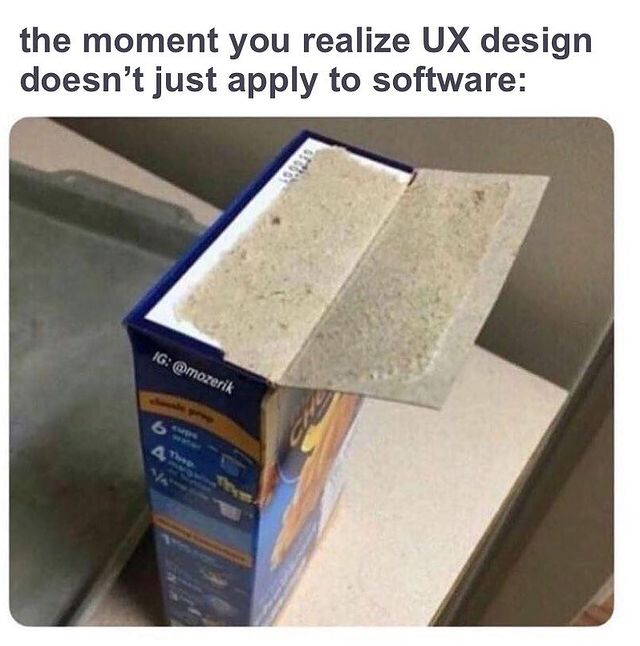
UX design memes, we know them and love them.
Whether you’re quickly sending one to a coworker or staying up until 3 AM scrolling through them on Reddit, memes are addictive. And UX design memes are a great way for the pros (like us) to relate to each other and share a laugh at the end of a stressful day.
But, what if we told you that you could learn more about the nuances of UX/UI design from memes? (Yes, we were doing a Morpheus impression while typing this.)

It’s true, though. In UX/UI design, we often rely on visuals to demonstrate a point, which is exactly what memes do. Albeit, they do it in a much more amusing way than a pie chart or graph.
These UX Design Memes will show you some special considerations to take before you begin, and maybe give you a sensible chuckle or two.
Design vs User Behavior
Looks only get you so far. What good is a beautiful design if the user has to jump through hoops to achieve their goals? This is the very idea behind behavioral design. If users are cutting corners anyway, meet them halfway and simplify the design as much as possible.

What’s The Difference?
We’ve all had a painful discussion with a family member about how UX/UI design is different from web design. Then you have to explain the difference between UX and UI design.
You may have seen this meme floating around, but it draws a clear distinction between the two. One design makes the product easier to use and the other is all about the look. It’s also incredibly helpful in explaining the intricacies of UX/UI design to clients.
Trust The Process
Once you get a new project in your hand, you may start to build a big picture in your mind of what the final product will look like. However, jumping straight to HiFi designs is a big no-no.
You need to have a solid foundation laid out to build a product that actually works. Understand what the stakeholders want and what the user needs, create some sketches and wireframes, and gather some feedback to validate your design decisions. Otherwise, the experience of using the final product will feel a little hodge-podge.

Research, Research, Research
A cool, creative design helps your company stand out from the competition. But if it creates new pain points for the user, it does more harm than good. User research and testing are crucial in avoiding problems post-launch, so spend plenty of time on them and don’t rush.

Inspiration, Not Imitation
They say imitation is the sincerest form of flattery. Your users and stakeholders will already have brands they gravitate towards — but directly copying your competitors won’t help your digital product design stand out to your users.
That’s not to say you can’t take inspiration from your competitors, but you need to change things enough to create a unique product. Think about Tinder and Bumble…they’re pretty similar apps, but what features or design elements draw users to one over the other?
Plus, UX design memes that use Obi-Wan Kenobi are always cool by us 😎

Is It Ever Really “Done”?
We’ve said it before and we’ll say it again, the product launch is just the beginning! User testing and iteration gets you a minimum viable product (MVP), but there’s always room to improve the product after it hits the market. Don’t be afraid to think long-term when you’re designing.
Remember, the UX design process allows you to revise and refine at any point. Use that to your advantage!

Ditch The Dark UX
What’s good for boosting conversions is good for the user experience, right? WRONG!!!
Yes, increasing conversions (either through product sales, demo requests, collecting emails, etc.) is the goal for most stakeholders. But effective UX designs have to take that and the user’s feelings into consideration.
Dark UX patterns get those precious conversions, but they don’t convert those users into long-term brand loyalists.
Focus on creating a satisfying experience for the user instead of instant gratification for the stakeholder.

Learn From Your Surroundings
UX design is a modern practice, but the concept behind it is as old as time. Think back to the invention of the wheel. How much easier did it make life in ancient Mesopotamia? How has the speed and efficiency of the wheel improved since then?
When you realize how UX impacts every single product you touch (in person or online) it becomes easier to empathize with everyday users and apply those practices to the digital products you create.
Don’t Force Account Creation
Say it with us… “Checkout as a guest” is your friend!
This specific meme is about applying for jobs, but it applies to almost all digital products. No one wants to take extra time to create an account when they just want to buy something or fill out a form.
In fact, 23% of users abandon the conversion funnel when they’re forced to create an account, so save some trouble and leave it out.

Save To Camera Roll
UX design memes are a great way to unwind and pass the time. But if you look a little closer, you can learn a thing or two from them.
So when you’re prepping for a new project or conducting some research, keep a close eye on Instagram or your favorite Reddit thread. You may just get some insight into user behavior or UX strategy.
Want to work with a meme-savvy team that makes the UX design process fun? We’ll have a good time while giving your product a look and feel your users will love. Start a project with us today!

I always say that UX inspiration comes from the world around us, and we can learn a lot from websites we’re constantly browsing. When planning for my summer vacation brought run-ins with countless hotel timetables and booking forms on travel websites, I paid attention to what worked and what didn’t. What was easy to use and what was simply annoying? I took notes on what made me exit the browser and what made me stay booking with certain companies.
Here’s what I learned.
A Quick lesson on UX/UI Usability
The travel websites I used the most had nailed the value of usability in User Experience. Although usability is a quality of User Interface (how easy something is to use), it’s also one of the many aspects of User Experience that involves “everything that affects the experience of the user.” According to the UX research firm Nielsen-Norman Group usability consists of five main goals: learnability, efficiency, memorability, errors, and user satisfaction.
Learnability:
How easy is it for users to follow a desired action? Can they accomplish basic tasks the first time they see the design?
Efficiency:
How quickly can tasks be performed?
Memorability:
If leaving and returning later, how quickly can they remember how the site works?
Errors:
If the user makes a mistake in the desired user flow, how quickly can they recover?
Satisfaction:
How pleasant is it to use?
These factors were what I used to determine whether a site was ultimately, easy and pleasant to use or just didn’t make the cut. As I browsed the void of travel websites (trust me there’s a lot out there) the best had the following features:
Where to Start
Planning vacations can be overwhelming, that’s why websites that gave me a place to start were automatically winning in the UX department. If a website is easy to use, it should be easy to navigate. Websites with a clear indication of where to start on the homepage took the stress out of planning a vacation. Since the homepage is usually the place with the most interaction, placing engaging and foolproof content will keep visitors intrigued and wanting to use your site.

Airbnb knows that its users are going to their website to find a place to stay in any desired location. In response, they placed a straightforward search engine on the top of their homepage, effectively keeping their site simple and easy to use. If you know where you want to go, it’s easy to search for places to stay, and if you’re a spur of the moment person, suggestions are right below the navigation. If you haven’t picked a destination yet, Airbnb prompts suggestions of homes you might like.
High Impact Imagery
You’re lying to yourself if baby blue water and resort photos don’t draw you in. Especially on travel websites, high impact imagery sells the experience. Instead of stock photos, select imagery that is reflective of the brand and services that motivate users rather than bores them. If the call to action isn’t strengthened by an image, it’s not the right photo. Imagery is supposed to evoke emotion from the users, and websites that showcased beautiful scenery made me want to book with those companies.

Lonely Planet utilizes high impact imagery throughout their entire homepage which inspires users to choose a destination. It also offers suggestions on what to do in those locations.
Simplicity
Travel websites often evoke an overwhelming feeling. So many options, so many deals, right? I immediately clicked out of any browser that was crowded and confusing, or cluttered with a thousand images and CTA’s. For user experience, “less is more” is a phrase to live by. Focusing on relevant information and keeping things simple is easier for viewers to follow a desired user path.

HomeAway doesn’t overwhelm the user with a thousand different pictures and navigation options. Their CTA is made more impactful with it’s simplicity.
Clear Navigation
With so many travel websites out there, it’s hard to differentiate and understand all the services one company offers just by looking at the homepage. That’s why having a clear navigation is essential. Navigations aren’t always self explanatory. Having clear categories that are recognizable can increase function on your site.

At first glance, TripAdvisors homepage looks like its only service is to help users find hotels, but it’s navigation clearly indicates where users can click to find out about other services. We naturally want to categorize and having sections to easily search on a navigation makes using travel websites all the more pleasant.
Easy to Use on Desktop & Mobile
If a travel website didn’t have an as equally easy to use mobile pairing, I didn’t use it as much. Given the nature of the demographics who use travel sites, often times it will be used in a mobile setting It’s important when visiting a site that they tackled their standing on both mobile and desktop. It’s even more important now than ever with Google changing its indexing and ranking to have prioritizes those sites with an exhaustive mobile platform. Since travel prices fluctuate so frequently it was nice to be able to open my phone and check what was available for what price while I was on the go.
Overall, the easiest sites for me to use were simple, innovative and clear. Although I was merely booking vacations, jumping from website to website revealed the necessity for UX. Instead of being frustrated browsing through a site that’s overwhelming, the travel industry is learning what increases conversions and customer experience overtime.

It’s a jungle out there, and while most of the jungle is wild and filled with some rather vicious monsters, we’d like to consider ourselves the jungle guides. Nothing scares us and no beast is too large to manage or tame (*cough* 10 cooks in a kitchen *cough*). Many of our previous clients return because they value the CreateApe difference and know that we are experts in our field when compared to what’s out there. The pickings are slim people!!
We attribute our success to a successful kick-off with our clients. The first meeting always dictates the tone, direction, and collaboration amongst our clients and our team. Our founder and CEO, Alessandro Fard, has broken it down to some key questions to kick off the meeting, and we’re proud to say it works!
Aside from narrowing down a meeting date, time, and location that works for everyone, we also have a general pattern of the questions we like to ask for the first meeting. We make it a point to hear out the client’s vision and expectations for their new product/service launch. Leadership is not just about directing the path and giving orders, leadership takes an open mindset and ability to adapt skill sets into the path we map out collaboratively speaking.
So what are these general key questions?
- What do they do?
- Why do they do what they do?
- What have they done or tried in the past?
- Why did they do it?
- What happened or what was the result?
- What do you think went wrong? Or right?
- What they hope to achieve next?
- Who’s going to be around to do it?

What’s your company about?
This question is a given. This is their opportunity to shine and dazzle you with a history of how they got started and where they see the company or product heading. The important part to address here as UX designers (which usually doesn’t come up) is how the company makes its revenue. Did you get that? HOW DO THEY MAKE MONEY?!? No money, no business. No business, NO client. NO CLIENT!!! WHAT?!
Create Ape knows successful UX ninjas prioritize not only the user, but the business as well. While learning the history and vision of the client, it is important to know the profit and benefit for both the user and the client from a business perspective. And guess what else? Some of the best challenges are when the users goals and the business goals are completely different. How do you marry the two? Great UX gurus live for that!
You also have a chance to address the essential reason of why they called you in the first place: how they can make it better and how they can MAKE MORE MONEY. What else draws businesses to launch new services and products?
With years of experience, it’s safe to say that most companies come with limitations, and it’s a ninja’s job to exploit those limitations and convert them into possibilities. Mind blown, yet?
What has been done thus far?
This question opens the discussion about time and money. Another favorite thing to talk about! Many times than not, a client comes to us when “sh*t hits the fan” and they are down to a final deadline, the last inning of the game with little to no resources left to spend. Then you’re left to clean up the mess, and possibly start from scratch…depending on the beastly damage. Yup, damage control. We said it!
Remember to keep realistic expenditures and time frames for clients, especially if they’ve already been burned. It is better to be real than to try to meet their demands in order to land the job. It all takes time and money, don’t beat around the bush! Transparency is what wins the client and keeps them coming back.
What should we review to be caught up to speed?
Give the client an opportunity to expound on what has worked and what has not. AND MEMORIZE IT!! Ok…maybe not memorize it, but definitely pay attention. This is different from the company history in that it relates specifically to the project at hand. This is important information to make sure that you’re not busting out the same ideas as the last team.
It also gives you feedback on direction and concept with what has worked in the past, and allows you to expand that concept to further limits. We love pushing limits, not buttons.. Dive deep into the core brand/product and don’t be lazy in your review.
SO don’t just flip specifically to what has worked and ignore what hasn’t. The stuff that didn’t work is equally as important. Knowing what exes to avoid from the past saves you time and money.
What would you like to achieve next?
While the client has already given you an overall goal of where they want to go. This question is meant to deepen the goal and methods or conversion rates they wish to apply.
Driving traffic is easy, but what you want the traffic to do is where the nitty gritty stuff comes in. Questions like: Do you want to increase sharing? Increase page views? Increase sign ups? Increase retention rates?
As the client answers these questions, explain to them that for every action there is a reaction. We can’t escape Newton people!! This will help you remain transparent (and apply some physics to your accolades) so that the client can decide what the priority is and how it will affect their results. You can’t have your cake and eat it too…..or can you?
Client Collaborators & Team Collaborators
Who is going to report to you and who will be reporting to them? When it comes to UX design it’s a lot smoother to have less collaborators because the more eyes it needs to reach the longer the turn around rate is before it actually gets approved. (Remember that kitchen *cough* we talked about?).
This swings both ways, and in an ideal world, we like to have 1-3 points of contact on a project to create true villain magic. It nicely ties back to our leadership spiel and navigating what it takes to successfully kick-off a product/service. Once you establish the team on both sides it helps establish you into that leadership role, which in turn helps everyone out and holds everyone accountable.
Another thing we’d like to address while on this topic is the method of communication that both teams will use to get the job done. One of our teams favorite is Slack. Be clear as to where the primary communication will go down so that the client knows exactly where to go to find the goods.
Sometimes with so many apps and management tools out there, it can be easy to get lost in communication. We also like to hold weekly meetings with our stakeholders to ensure that everything is getting communicated effectively and that goals are being met by the team.
Lastly, let them know you got this:

The grand finale of the meeting is your chance to shine. We know it sucks holding in all of your awesomeness until the end, but trust us it works!
The conversation should end with the approach you’d like to take from there–that first meeting. Yup, how are you planning to tame the beast?
Talk about the research you plan to review of previous successes and disasters to avoid. Also mention future steps after reviewing everything they give you, the interview and selection of users you’d like to talk to, and the outcome of the similarities and/or differences that affect the vision of the product.
More future topics to shine light on include: the product mission statement, competitive design principles, success metrics to track, wireframes, and prototypes. Let the client know that through every step of the way, from infancy to maturity, you will be holding their hand–advising and answering any questions that arise.
Yes–these secondary steps will follow the initial approach, but it is important to highlight what is ahead so that they can see a light at the end of the tunnel and know what to expect from a UX ninja.
Recap…
- First meeting MATTERS MOST.
- Leaders aren’t cocky, they’re open-minded.
- Let the client shine FIRST.
- Prompt the client further with key questions.
- Don’t be lazy, do the research.
- Get to know the team you’ll be working with.
- Seal the DEAL!
It’s been a fun tour of this jungle ride, but now it’s time for us to go tame more beasts!! We hope you feel better equipped to do the same. Or at least more organized with the kick-off flow. ?
Let’s Work Together!
It’s a jungle out there — let the Create Ape experts help you traverse the wilds as we take your project to new heights.


